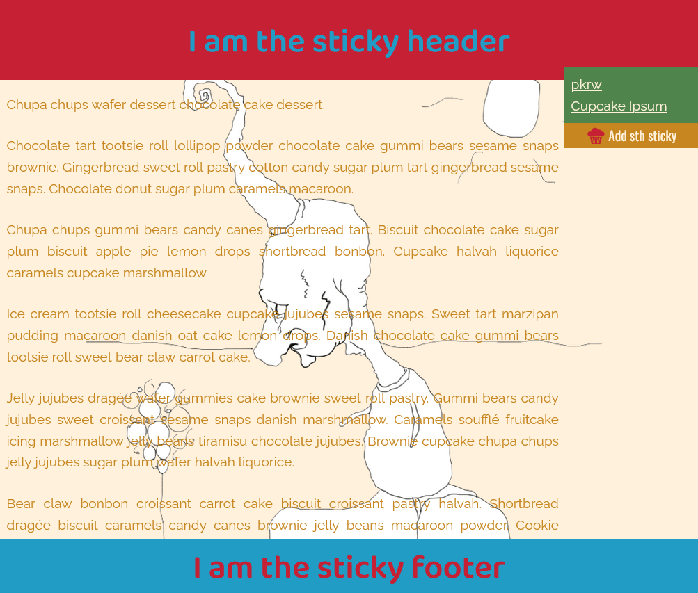
The Sticky Header & Footer
The page layout includes header and footer elements that do not scroll with the rest of the page. The “sticking” effect is achieved by applying the CSS property position: sticky to these elements. By setting the top: 0 value for the header and bottom: 0 for the footer, they are positioned at the top and bottom of the page, respectively, and remain in place as the user scrolls.
In order to keep the footer at the bottom of the page, a flex layout is utilized. The display: flex property is applied to the parent element of the footer, and the middle column is set to grow with a flex-basis property value of auto.
.sticky-container {
  display: flex;
  flex-direction: column;
  min-height: 100vh;
}

.sticky-header {
  position: sticky;
  top: 0;
  left: 0;
  right: 0;
  padding: 1em 0;
}

.sticky-footer {
  position: sticky;
  left: 0;
  right: 0;
  bottom: 0;
  flex-shrink: 0;
}

.sticky-main {
  flex: 1 0 auto;
  padding-right: 12.5rem;
  padding-left: 0.5em;
}

.sticky-menu {
  position: fixed;
  right: 0;
}
Demo on GitHub
