The columns of the gallery layout are arranged using an explicit grid, while the rows are built with an implicit grid so that the layout is not constrained to a fixed number of pictures. The auto-fill keyword in the grid-template-columns property instructs the browser to place as many tracks as possible onto the grid. Additionally, the dense value in the grid-auto-flow property allows items to fill gaps in the grid, even if it changes the order of the items.
Gallery Grid Layout – implicit grid rows
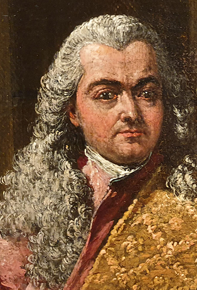
Bernardo… Who was he? What did he know?
Now we know… they are among us.


.grid-layout {
  grid-template-columns: repeat(auto-fill, minmax(200px, 1fr);
  grid-row-auto: 1fr;
  grid-gap: 0.5em;
  grid-auto-flow: dense;
}
.grid-layout .grid-layout__item:nth-child(even) {
  grid-column: span 2;
  grid-column: span 2;
}