CSS Flexible Box Layout
CSS flexbox is a layout model in CSS that allows to arrange and align items within a container. The layout can adapt to different screen sizes and devices. The model works by defining a container element and one or more child elements that will be arranged within that container. Then it can be specified how the child elements should be laid out, including their direction, order, alignment, and size.
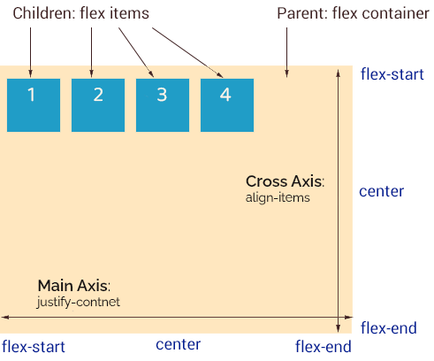
The CSS flexbox layout is one-dimensional, it operates along single axis so is best to use to arrange rows or columns.
The default flexbox layout
Syntax:
The CSS rule for a flex container – the parent of flex items:
.flex-container {
    display: flex | inline-flex;
}
CSS properties used with a flex parent:
| Property | Initial value | |
|---|---|---|
| flex-direction | row | Use to set items on desirable axis and direction (normal or reversed). |
| flex-wrap | nowrap | Use to force items onto one line or to wrap onto multiple line. |
| justify-content | flex-start | Use to align items on the main axis. |
| align-items | stretch | Use to align items on the cross axis. |
| align-content | stretch | Use to set the distribution of space between and around items along a flexbox’s cross axis. |
The shorthand
The flex-flow CSS property is a shorthand property for: flex-direction and flex-wrap
flex-flow: flex-direction flex-wrap;The CSS properties used with flex items
| Property | Initial value |
|---|---|
| order | 0 |
| align-self | auto |
| flex-grow | 0 |
| flex-shrink | 1 |
| flex-basis | auto |
The shorthand
flex property is a shorthand for three sizing properties: flex-grow, flex-shrink, flex-base.
flex: flex-grow flex-shrink flex-base;For example flex: 3 is equivalent:
flex-grow: 3;
flex-shrink: 1;
flex-basis: 0%;
The flex shorthand property, when set to flex: 3, only specifies the value of flex-grow, while flex-shrink takes its default value of 1. Additionally, if flex-basis is not explicitly defined elsewhere in the code, it will be set to 0%.
See the Pen flexbox flex by majadc (@majadc) on CodePen.
Examples
.flex-container {
  display: flex;
  flex-wrap: wrap;
}
1. Defaults values for flex properties
flex-grow: 0;
flex-shrink: 1;
flex-basis: auto;2. Default values for flex properties with a declared width property.
width: 250px;3. Setting value for flex-basis
flex: 0 1 250px;
width: 100px;
However, if flex-basis is declared, the value of width is omitted.
4. Changing default values of flex-grow and flex-shrink
flex: 1 0 250px;5. Allowing flex items growing and shrinking
flex: 1 1 250px;Related
- Flexbox: flex-direction
- Flexbox: flex-wrap
- Flexbox: justify-content
- Flexbox: align-items
- Flexbox: align-content